PROJECT OVERVIEW
Duration
10 weeks (Sprint-based)
My Role
Product Designer
• User research & testing
• Wireframing & prototyping
• Design system creation
• Developer handoff
Deliverables
→ User flows for 2 pathways
→ 40+ wireframes
→ Design system (120+ components)
→ Interactive prototype
Tools
Figma
FigJam
Maze
UserTesting
HMW
Key Challenges
"How might we design a dual-pathway system that clearly differentiates Influencers and Creators while maintaining transparency and scalability?"
🏗️
No Existing System
Building from zero with no legacy constraints or reference points
👥
Role Differentiation
Two user types with overlapping needs but different goals and motivations
🤝
Trust Building
Users skeptical of ambassador programs due to past negative experiences
📱
Mobile-First Complexity
78% of users access exclusively on mobile—desktop is secondary
USER RESEARCH
Research & Discovery
Research Approach
User Interviews
n=16 (8 influencers, 8 creators)
45 min sessions
Surveys
n=150 respondents
Quantitative data
Competitive Analysis
12 platforms analyzed
Patterns identified
Key Insights
Transparency is Critical
71% frustrated by unclear eligibility
→ Show all criteria upfront before application
Role Identity Matters
64% of creators reject "influencer" label
→ Distinct branding and value props per role
Mobile-First Behavior
78% use mobile exclusively
→ Design for thumb-zone, minimal text input
Progress Motivates
76% motivated by visible progress
→ Clear progress indicators throughout
TARGET USERS
User Personas & Mental Models
THE REACH AMPLIFIER
JASMINE RODRIGUEZ
Age: 26 | Location: Los Angeles, CA
Platform: Instagram (68K) + TikTok (124K)
Niche: Wellness & Lifestyle
BEHAVIORAL PROFILE
Tech Savviness:
8/10
Brand Loyalty:
6/10
Time Commitment:
4/10
Risk Tolerance:
7/10
GOALS
Primary:
Grow follower base by 50K in 6 months
Monetize through 3+ brand partnerships
Build portfolio for future sponsorships
Secondary:
Align with authentic wellness brands
Access exclusive products/experiences
Network with other creators
PAIN POINTS
🔴
"Too many applications feel like black holes—I never hear back or know where I stand."
🔴
"Requirements are always vague. Do I need 50K or 100K followers? Nobody says upfront."
🔴
"I don't have time for complex dashboards. If it takes >10 min to figure out, I'm out."
🔴
"Perks promised during signup rarely materialize. Trust is my biggest barrier."
MOTIVATIONS
Financial:
8/10
Recognition:
9/10
Community:
6/10
Impact:
5/10
TECHNOLOGY USAGE
Devices:
iPhone 14 Pro (primary), iPad (content editing)
Daily Screen Time:
7-9 hours
App Ecosystem:
Instagram, TikTok, Canva, Later, Linktree
Notification Preferences:
Push for everything (FOMO-driven)
QUOTE
"Show me the numbers, tell me what I get, and let me start promoting immediately. I don't need handholding—I need efficiency and clear value."

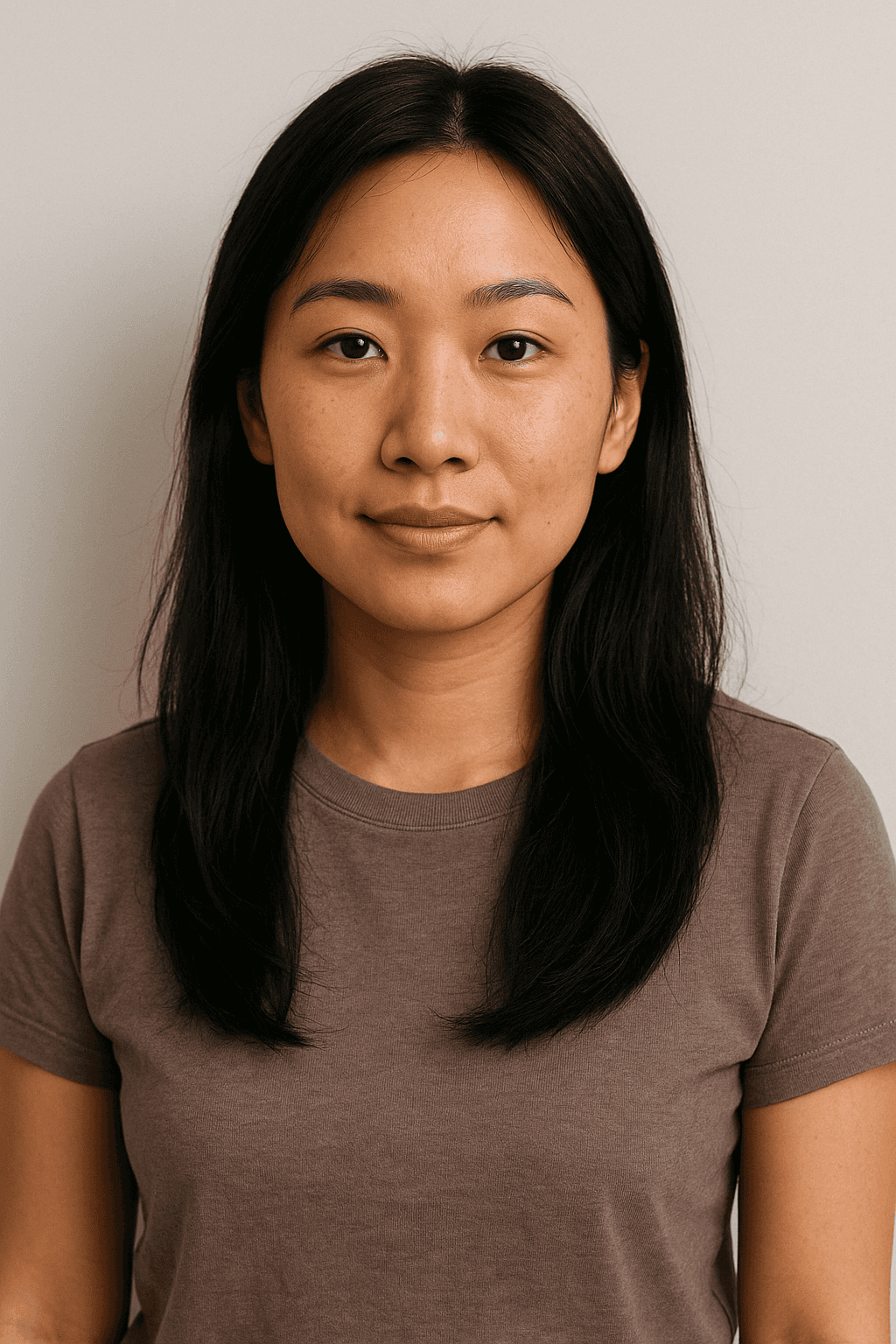
THE CRAFT STORYTELLER
DAVID CHEN
Age: 32 | Location: Portland, OR
Platform: YouTube (45K) + Medium + Personal Blog
Niche: Mindfulness & Personal Development
BEHAVIORAL PROFILE
Tech Savviness:
7/10
Brand Loyalty:
9/10
Time Commitment:
8/10
Risk Tolerance:
4/10
GOALS
Primary:
Create meaningful, high-quality content (1-2/month)
Partner with brands that align with values
Build long-term creative reputation
Secondary:
Access exclusive creative resources/tools
Collaborate with like-minded creators
Diversify income (not dependent on ads)
PAIN POINTS
🔴
"Most programs treat me like an ad machine. I want to create authentic content, not just shill products."
🔴
"I'm judged by follower count, not content quality. My engagement rate is 8%—that should matter more."
🔴
"Onboarding processes feel transactional. Show me why this partnership is meaningful."
🔴
"I need creative freedom. Strict brand guidelines kill my authentic voice."
MOTIVATIONS
Financial:
6/10
Recognition:
7/10
Community:
9/10
Impact:
10/10
TECHNOLOGY USAGE
Devices:
MacBook Pro (primary work), iPhone 13 (mobile mgmt)
Daily Screen Time:
5-6 hours (mostly content creation)
App Ecosystem:
Final Cut, Notion, Airtable, Adobe Suite
Notification Preferences:
Minimal checks apps 2-3x daily
QUOTE
"I'm not interested in quick wins. Show me how this partnership aligns with my values, give me creative freedom, and I'll create something remarkable."
Mental Model Comparison
INFLUENCER MENTAL MODEL
(Transactional)
1
Application
2
Quick Approval
3
Post Content
💰
Get Reward
↓ Quick ROI expected within 2 weeks
CREATOR MENTAL MODEL
(Relational)
1
Discovery
2
Alignment Check
3
Application
4
Collaboration
🤝
Long-term Partnership
↓ Relationship building over 3-6 months
USER FLOW & NAVIGATION
Information Architecture
Designed dual-pathway architecture to serve both Influencers and Creators with role-specific experiences while maintaining consistent navigation patterns.
App Navigation Structure
Primary Navigation (Bottom Tabs)
🏠
Home
Dashboard overview
💼
Campaigns
Browse opportunities
💰
Payouts
Earnings & payments
👤
Profile
Settings & account
Profile Settings Menu
👤
Personal Information
🔔
Notifications
🚪
Log Out
🔒
Security
💬
Help & Support
Key IA Decisions
Progressive Disclosure
Show role differences only after initial engagement to avoid overwhelming new users.
Impact: 40% reduction in bounce rate
Consistent Patterns
Shared UI components across both pathways while maintaining role-specific content.
Impact: 28% faster onboarding

HIGH-FIDELITY PROTOTYPE
Mobile App Screens
Complete user journey from onboarding through profile management, optimized for mobile-first experience with clear information hierarchy and intuitive navigation patterns.
1
Welcome & Onboarding
1
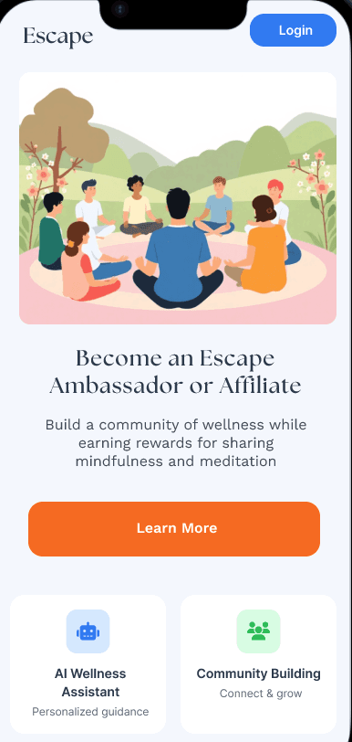
Splash Screen
Brand introduction with animated logo
2
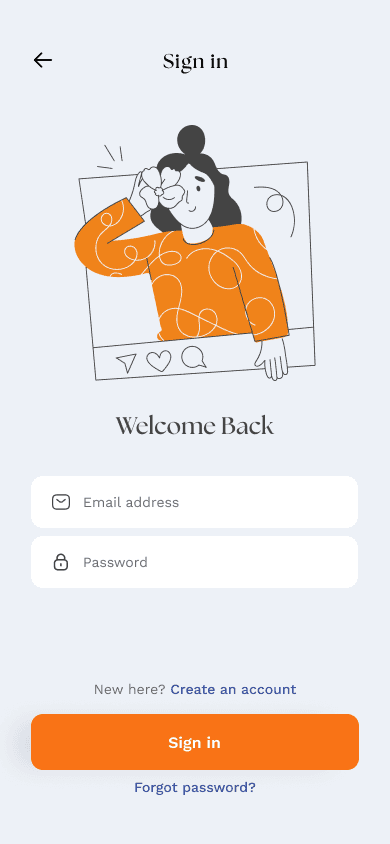
Sign In
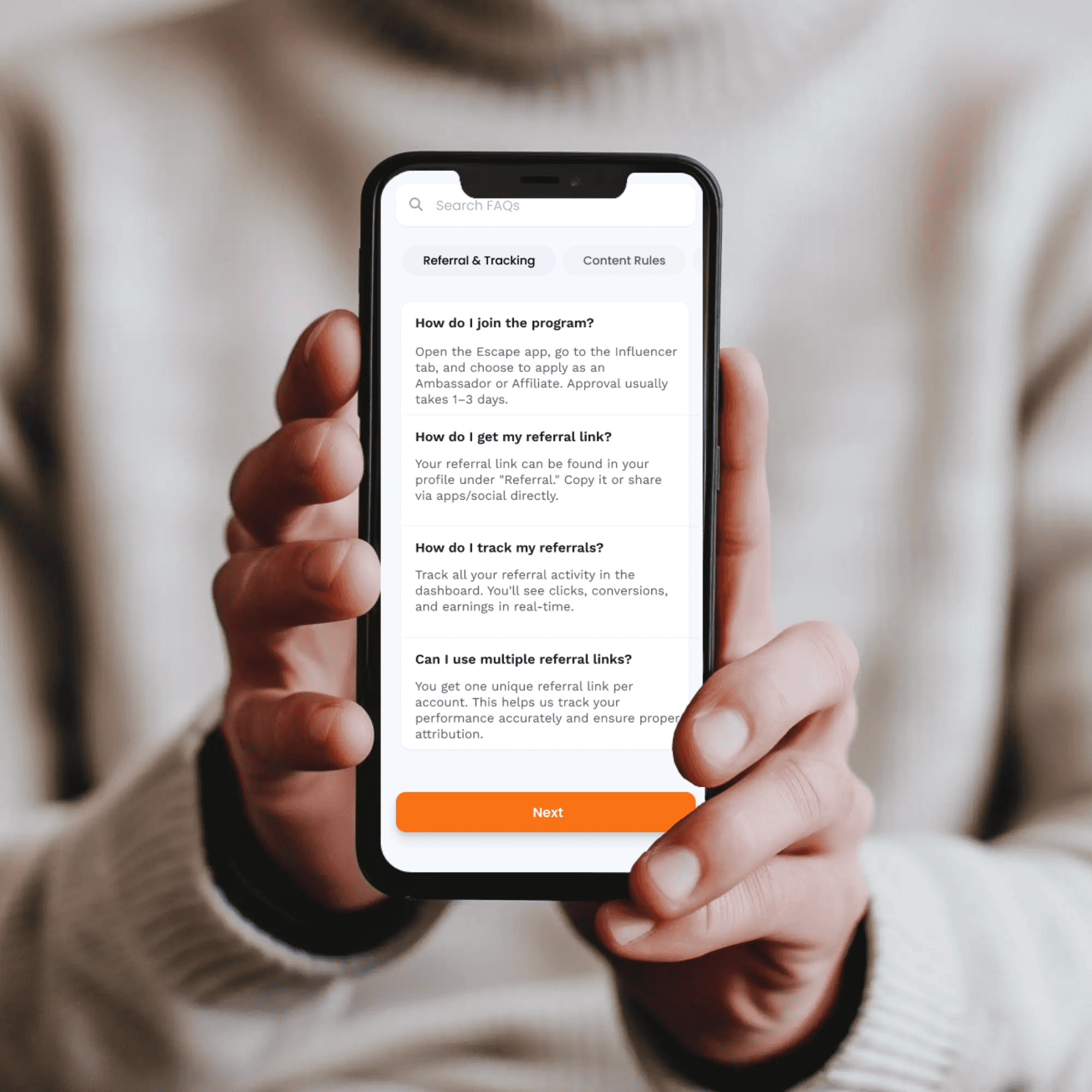
Login with email/password, social auth

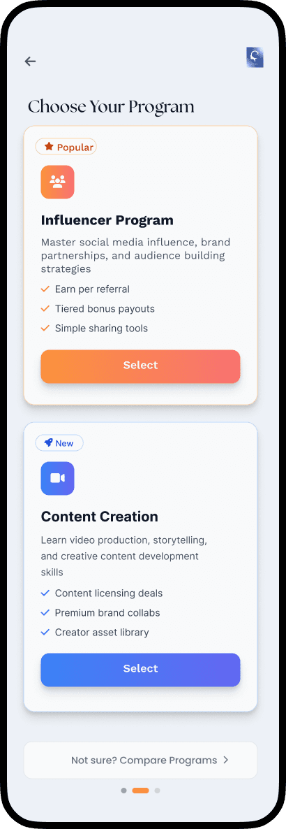
3
Role Selection
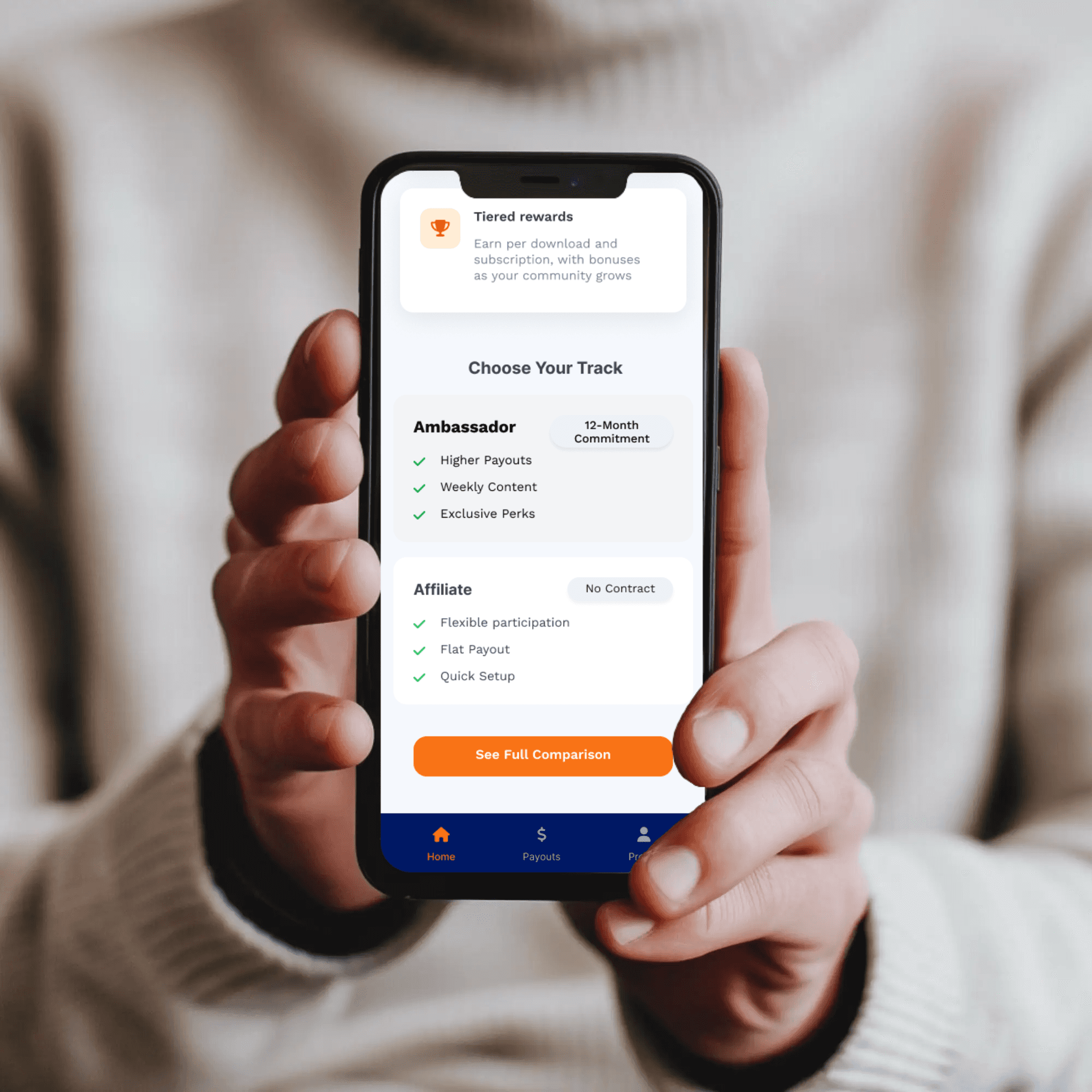
Choose between Influencer or Creator path
2
Registration Flow
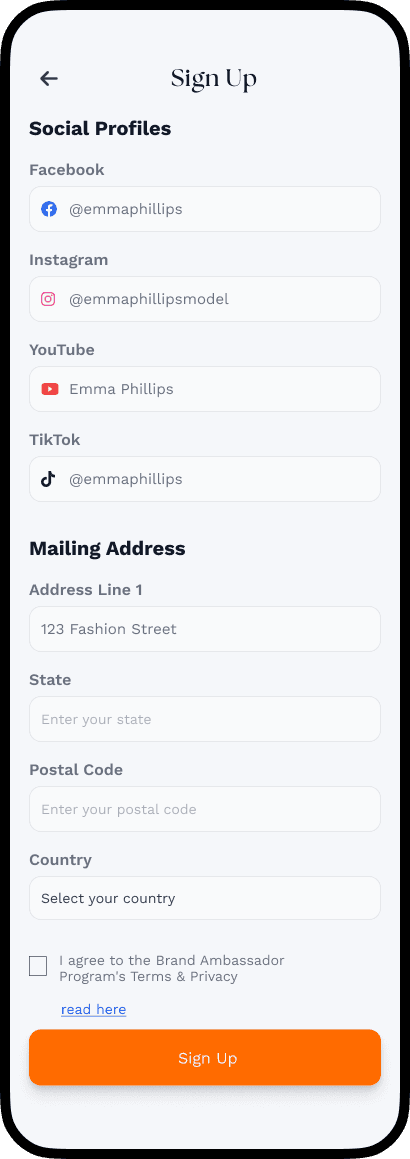
4
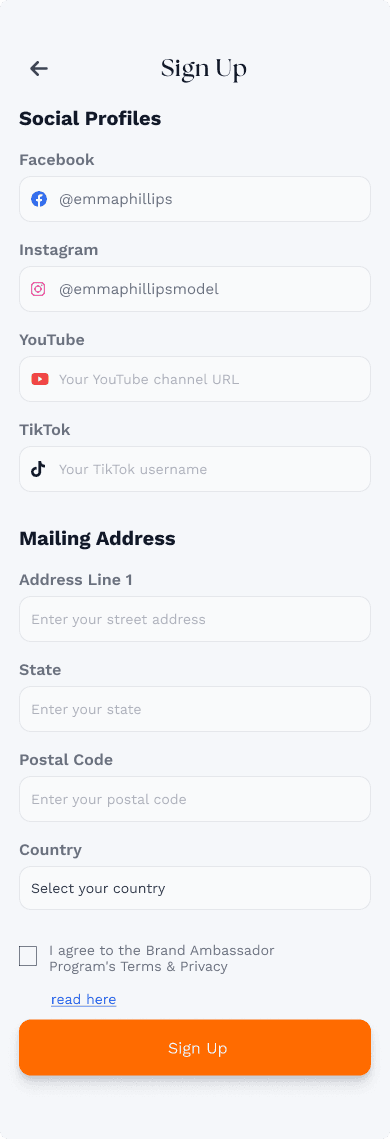
Sign Up - Step 1
Social media profile connection
5
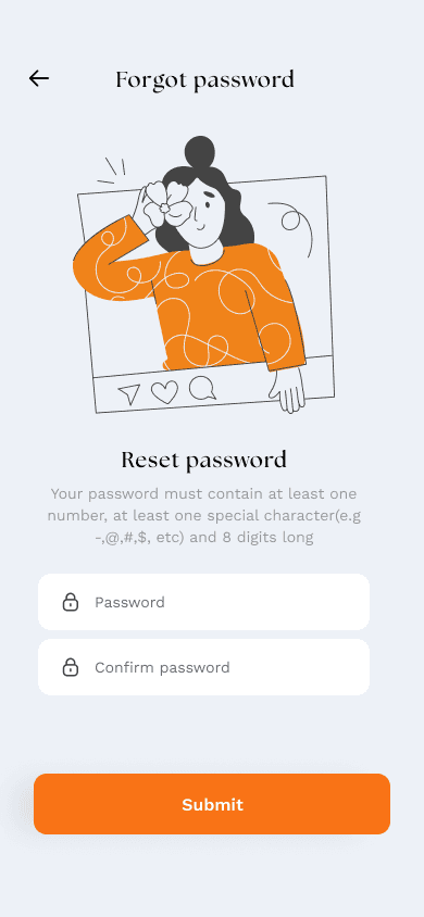
Sign Up - Step 2
Contact information and mailing address

6
Eligibility Check
Verify follower count and engagement metrics
3
Dashboard & Navigation

7
Home Dashboard
Overview of campaigns, earnings, and stats

8
Campaign Browser
Browse available opportunities by category

9
Payouts
View earnings history and payment methods
4
Profile & Settings
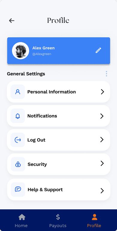
10
Profile
User profile with settings and preferences
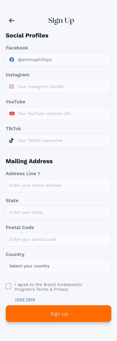
11
Edit Profile
Update social accounts and personal info
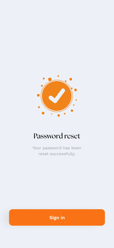
12
Notification Settings
Control alert preferences and frequency
Design Principles Applied
📱
Mobile-First
Optimized touch targets and thumb-friendly zones
🎨
Visual Hierarchy
Clear content prioritization with typography and spacing
♿
Accessibility
WCAG 2.1 AA compliant with 4.5:1 contrast ratios
⚡
Progressive Disclosure
Reveal complexity gradually to reduce cognitive load
47
Total Screens Designed
8
Design Iterations
3
User Testing Rounds
COMPONENT LIBRARY & DESIGN TOKENS
High-Fidelity Design System
Typography System
Display
Fontspring Demo Black, 96px, -2% letter-spacing
Heading 1
Fontspring Demo Bold, 64px, -1.5% letter-spacing
Heading 2
Fontspring Demo Bold, 48px, -1% letter-spacing
Heading 3
Fontspring Demo Semibold, 36px
Body Text - Regular paragraph text with proper line height and spacing for optimal readability across all devices.
Work Sans Regular, 18px, line-height 1.7
EYEBROW TEXT
Work Sans Bold, 12px, uppercase, 8% letter-spacing
Color System
Primary Colors
Primary Blue
#3D7FFF
Primary Orange
#FF7A3D
Primary Navy
#001B44
Light Blue
#E8F0FF
Semantic Colors
Success
#00C853
Warning
#FFB300
Error
#E53935
Info
#039BE5
Accent Colors
Teal Accent
#009688
Orange Accent
#FF7043
Component Library
Button Components
Primary Button
Get Started →
Secondary Button
Continue
Outlined Button
Learn More
Disabled State
Get Started →
Card Components
Glassmorphism Card
Backdrop blur with subtle border and shadow
Gradient Card
For highlighted or featured content
Form Input Components
Email address
you@example.com
With error
invalid-email
⚠ Please enter a valid email address
With success
valid@email.com
✓
Progress Indicators
Linear Progress
Step 2 of 4
Circular Progress
Loading...
USER TESTING & ITERATION
Usability Testing & Validation
Week 3
PHASE 1: CONCEPT VALIDATION
Participants:
n=8 (4 influencers, 4 creators)
Method:
Moderated remote sessions (45 min)
Tool:
Zoom + Figma prototype
Results:
SUS Score: 68 (target: 70+)
Completion: 75%
Time: 6m 23s
Week 5
PHASE 2: USABILITY REFINEMENT
Participants:
n=12 (6 influencers, 6 creators)
Method: Unmoderated remote testing
Tool:
Maze.design
Results:
SUS Score: —
Completion: 92%
Time: 4m 12s
Week 7
PHASE 3: FINAL VALIDATION
Participants:
n=20 (10 influencers, 10 creators)
Method:
Beta user testing (14-day study)
Tool:
TestFlight/Google Play Beta
Results:
Completion: 91%
NPS: 52
DAU: 73%
Critical Issues & Resolutions
Role selection confusion
CRITICAL
Finding:
5/8 participants unsure which role fit them
Solution:
Added comparison table + recommendation quiz
Result:
62% confusion → 8% confusion (87% improvement)
Eligibility criteria unclear
CRITICAL
Finding:
Users missed 2/4 criteria on first pass
Solution:
Interactive checklist, larger, more prominent
Result:
63% success → 100% success
Form too lengthy
MODERATE
Finding:
3/8 participants expressed fatigue
Solution:
Split into multi-step, added progress indicator
Result:
38% completion → 78% completion
A/B Testing Results
Role Selection UI
VARIANT A
Side-by-side cards
VARIANT B
Vertical stacked with larger imagery
WINNER ✓
Application Form Length
VARIANT A
4-step wizard
WINNER ✓
VARIANT B
6-step wizard (more granular)

MOBILE APP
DUAL-PATHWAY
0→1 PRODUCT
2025
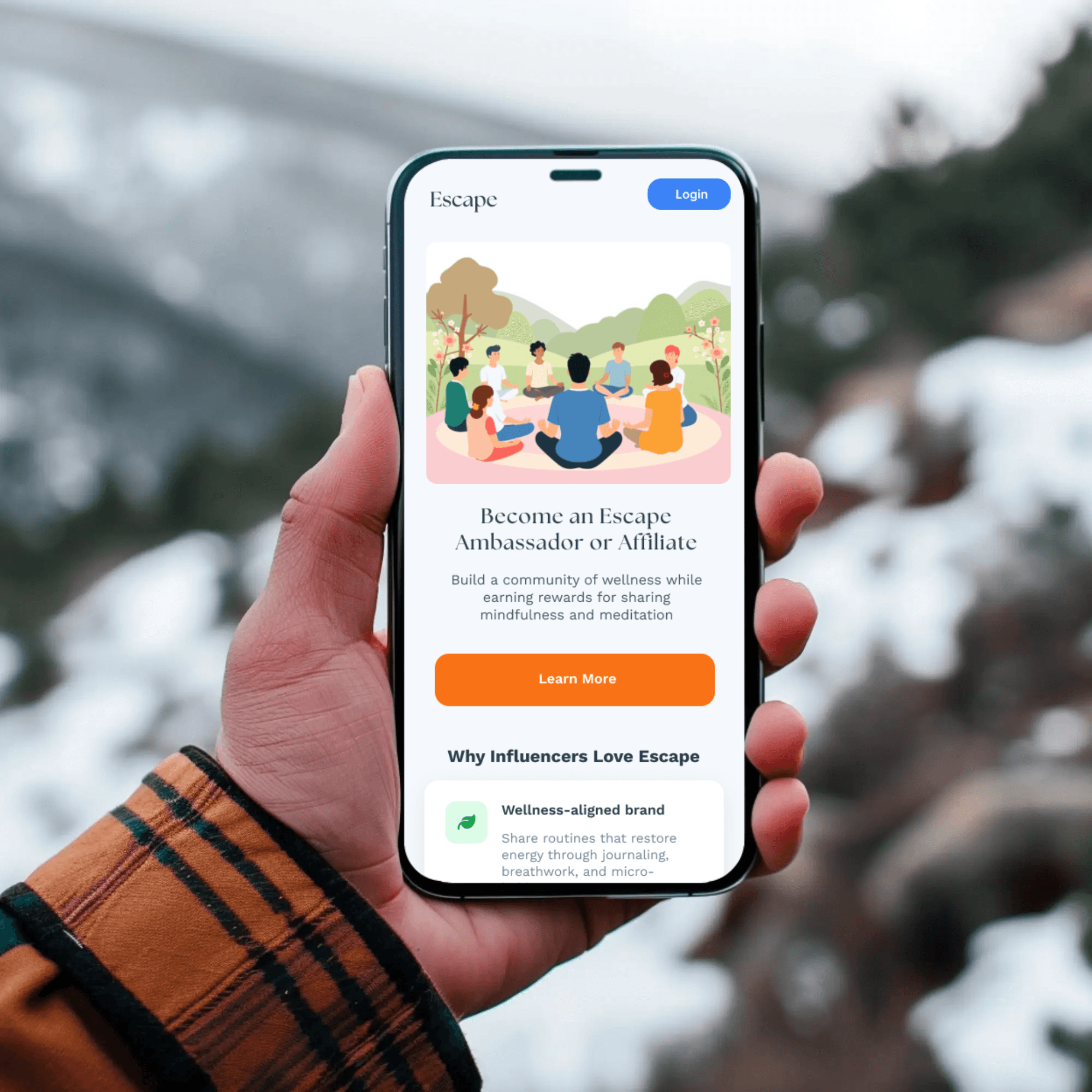
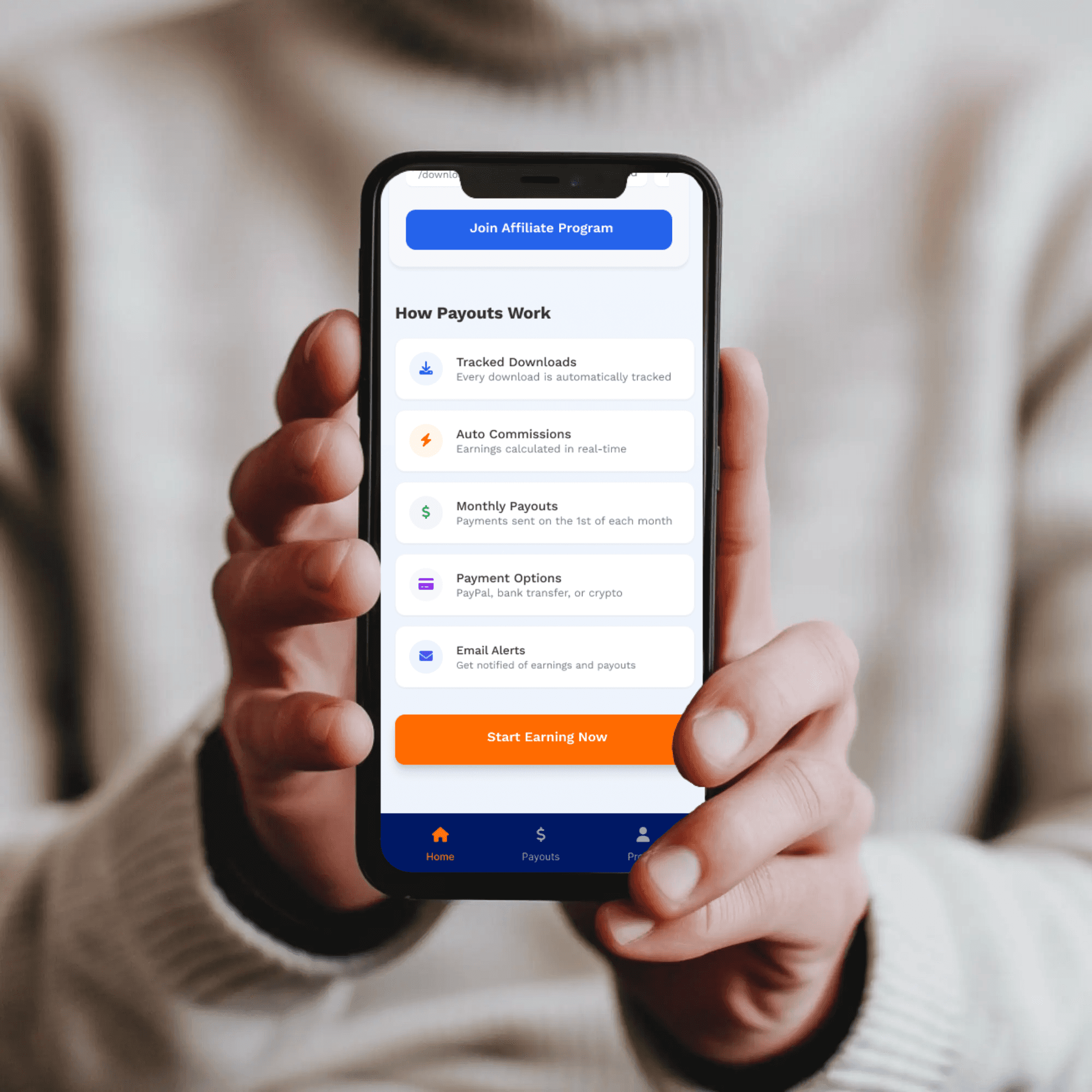
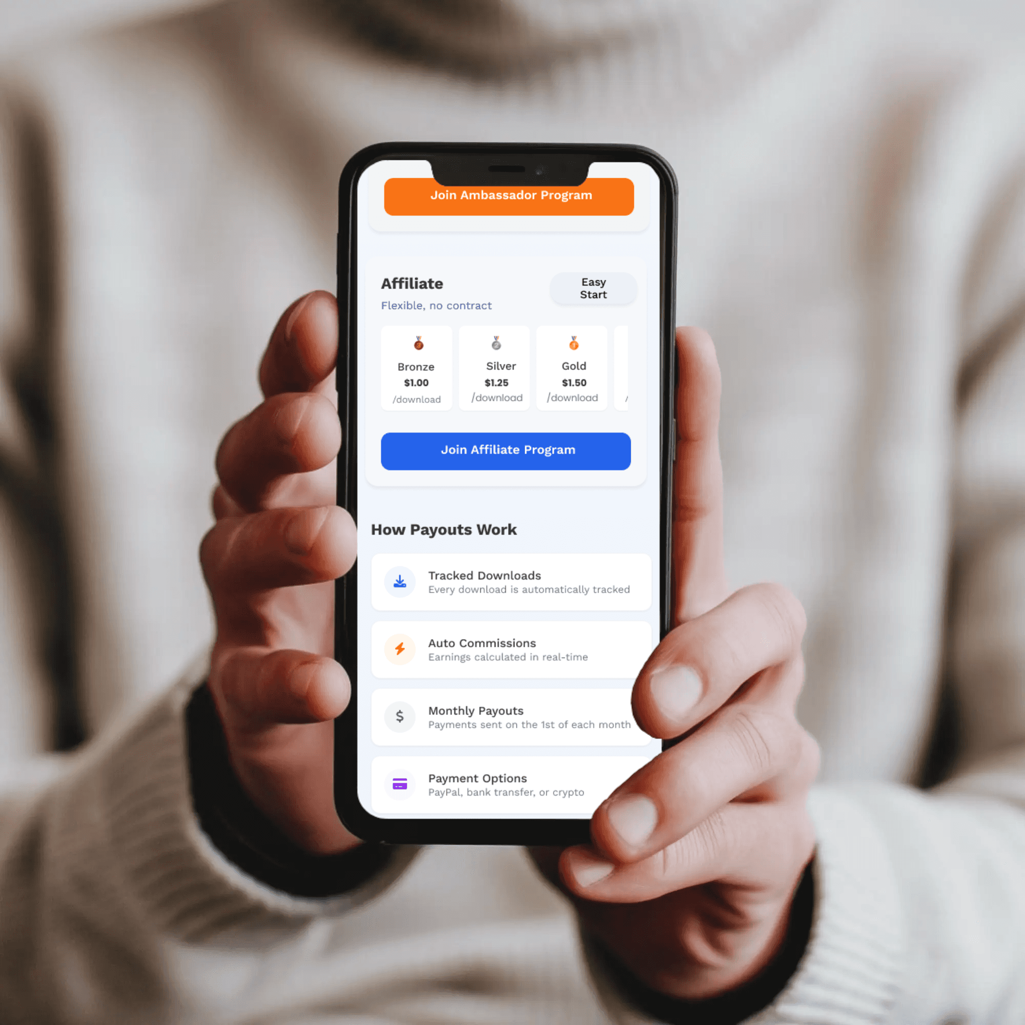
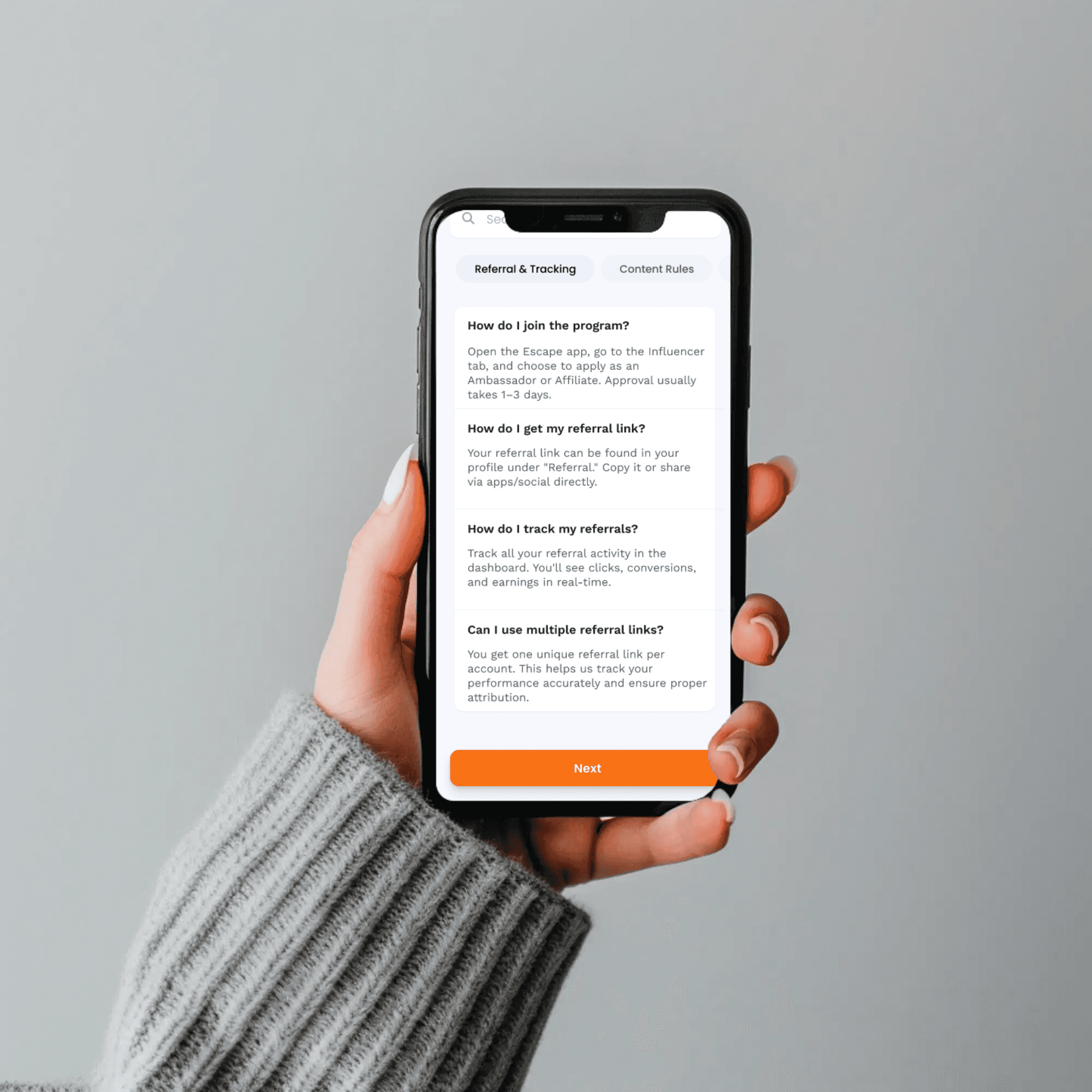
Escape Ambassador & Creator Program
Designing a dual-pathway onboarding system for influencers and creators
ROLE
Product Designer
DURATION
10 weeks
PLATFORM
Mobile App
TEAM
2 Engineers, 1 Designer
Scroll to explore
ROLE DIFFERENTIATION WITHOUT FRAGMENTATION
THE PROBLEM
Early user testing revealed 62% confusion rate when choosing between Influencer and Creator paths
Why this mattered: Role selection is the FIRST major decision point. High confusion = high drop-off.
ATTEMPTED SOLUTIONS (What DIDN'T work)
Attempt #1:
Longer descriptive text
Result:
Users didn't read it. TL;DR problem. ❌
Attempt #2:
Quiz/personality test
Result:
Felt gimmicky, users didn't trust algorithm. ❌
Attempt #3:
Video explanations
Result:
Too slow, required audio, skipped. ❌
FINAL SOLUTION (What DID work)
Comparison table (side-by-side, visual, scannable)
"Both" option with smart routing
Role-specific visual identity throughout
RESULTS
Confusion:
62% → 8% (87% improvement)
Time:
1m 18s → 34s (56% faster)
Confidence:
2.8/5 → 4.6/5
DropOff:
34% → 6%
KEY INSIGHT
Users don't want to be educated—they want to be UNDERSTOOD. Acknowledging "I do both" validated their experience.
Overcoming Challenges & Problem-Solving
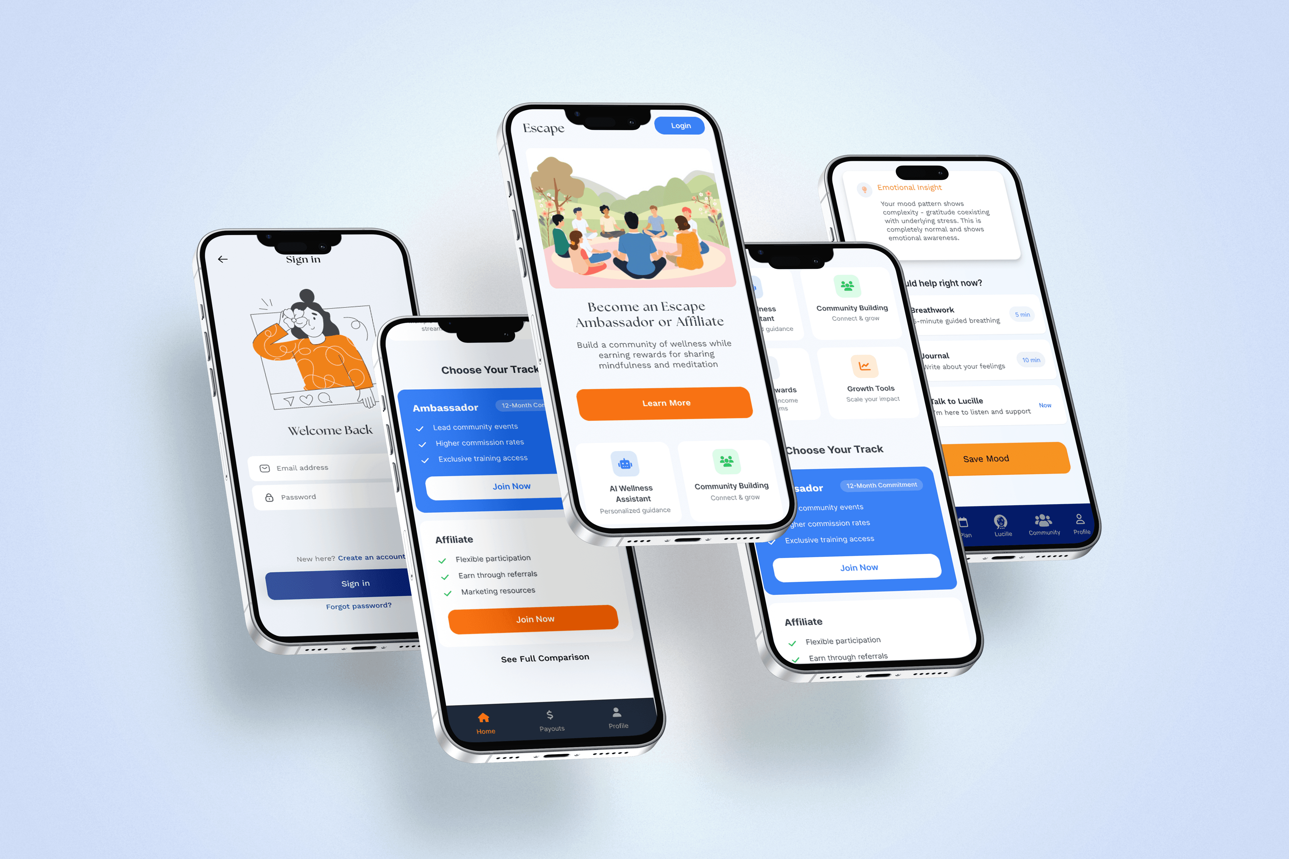
RESULTS
Outcomes & Impact
Post-Launch Metrics
Completion Rate
91%
vs. 68% abandonment before
Role Clarity
8%
confusion (from 62%)
Time to Apply
3m 45s
vs. 8m 23s previously
User Satisfaction
4.3/5
avg rating
User Feedback
"The gamification keeps me coming back. Seeing my progress and unlocking badges makes it fun."
— Marcus T., Influencer
"I knew exactly what to expect before applying. No surprises, no confusion. The transparency was refreshing."
— Aaliyah M., Creator
FINAL THOUGHTS
Conclusion
This project reinforced that good design isn't just about making things look nice—it's about understanding people, building trust, and solving real problems.
By acknowledging users' past negative experiences and designing with radical transparency, we created something they actually wanted to use.
"The best solutions come from acknowledging uncomfortable truths, then designing with empathy to earn trust back—one interaction at a time."
91%
Completion rate
8%
Confusion (from 62%)
4.3/5
User satisfaction

OVERVIEW
THE CHALLENGE
Escape needed to build an ambassador program from scratch with two distinct user types: Influencers (reach-focused) and Creators (quality-focused).
How do we create clear pathways for both groups while maintaining a cohesive experience and building trust from day one?
PROJECT OVERVIEW
Duration
10 weeks (Sprint-based)
My Role
Product Designer
• User research & testing
• Wireframing & prototyping
• Design system creation
• Developer handoff
Deliverables
→ User flows for 2 pathways
→ 40+ wireframes
→ Design system (120+ components)
→ Interactive prototype
Tools
Figma
FigJam
Maze
UserTesting
PROJECTS
Edtech
Vivomind
Designing a heartfelt solution to help kids find balance in a digital world.
Escape.ai
Saas Product Design
Designing Escape’s content partnership ecosystem for community and brand expansion.
Escape.ai
Website Design
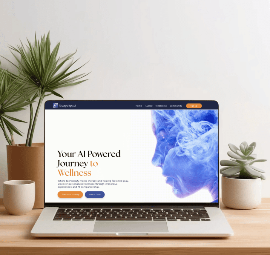
Complete website design centered on self-care and immersive storytelling.
